
Coco Veda
One brand. Many everyday moments.


BEHIND THE
WORK.
EC worked with Coco Veda on the evolution of its visual identity, including a redesigned logo, and translated that refreshed brand into social content and customer-facing collateral. The relationship has continued beyond the initial brand work, with creative applications spanning product communications, sustainability storytelling and digital marketing.
SAME ROOTS.
NEW SYMBOL.
From the original coconut-and-leaf wordmark to a compact circular identity. The redesigned mark gives Coco Veda a recognisable signature across packaging, social content and brand communications.

THE BRAND
IN ACTION.

THE IDEA.
THE EXECUTION.
Natural, but never ordinary.
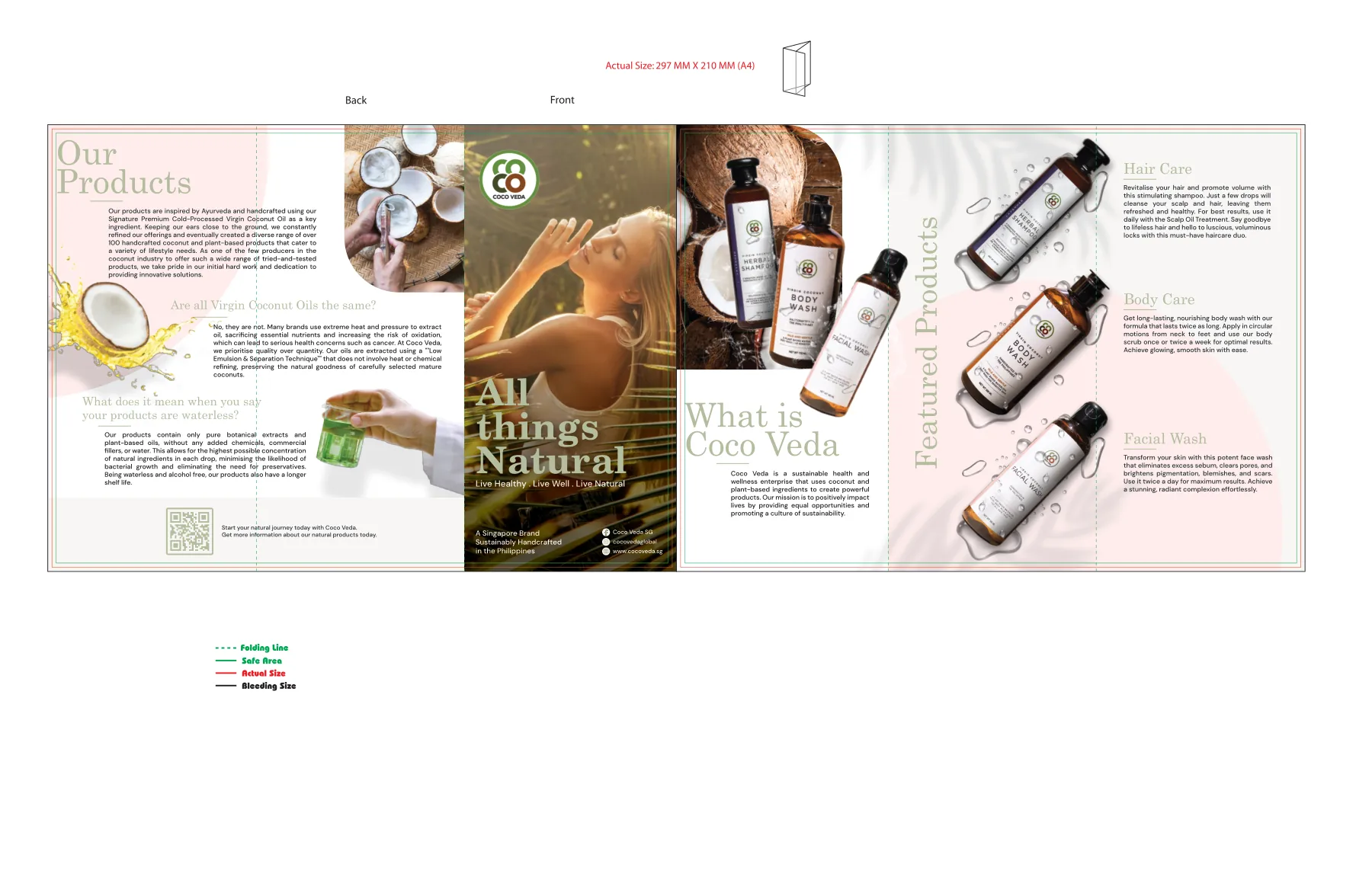
The redesigned Coco Veda logo established a recognisable centre for the brand. Across product and sustainability communications, the creative work keeps that identity visible while allowing the subject matter—ingredients, people and products—to take the lead.
02 / 06BUILT TO
BE SEEN.
The selected artwork shows the redesigned logo in real branded applications, alongside social posts and printed brochure design. The execution connects identity, product communication and the brand’s sustainability message without claiming unverified campaign results.
PROJECT CONTEXTHistorical engagement under EC; current partnership ongoing. Selected artwork from archived design files.